Form follows function – In bodies & buildings
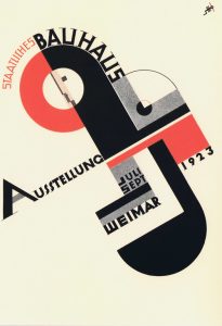
This December I came across the architectural design of ‘Bauhaus’ in Tel Aviv. The Bauhaus, a German word meaning “house of building”, was a school founded in 1919 in Weimar, Germany by architect Walter Gropius. The Bauhaus was the most influential modernist art school of the 20th century, one whose approach to teaching, and understanding art’s relationship to society and technology, had a major impact both in Europe and the United States long after it closed. The school is also renowned for its faculty, which included artists Wassily Kandinsky, Josef Albers, Laszlo Moholy-Nagy, Paul Klee and Johannes Itten, architects Walter Gropius and Ludwig Mies van der Rohe, and designer Marcel Breuer. UNESCO names Tel Aviv’s white city a world heritage site, this refers to the 4000 Bauhaus style buildings. Tel Aviv has the largest number of buildings in the Bauhaus/International Style of any city in the world.
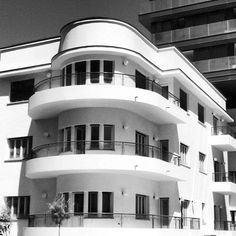
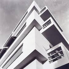
The motivations behind the creation of the Bauhaus lay in the 19th century, in anxieties about the soullessness of manufacturing and its products, and in fears about art’s loss of purpose in society. Creativity and manufacturing were drifting apart, and the Bauhaus aimed to unite them once again, rejuvenating design for everyday life. So what has Bauhaus got to do with movement and symmetry? Bauhaus believed in functional rather than symmetrical buildings. Bauhaus design is based on the principle that art and craft should be combined, blurring the distinction between form and function. The style is noted for its absence of ornamentation and the harmony of aesthetic design and utility of form following function.
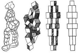
 Bauhaus principles and its relation to movement.
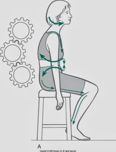
- Form Follows Function – is a principle associated with modernist architecture and industrial design in the 20th century. The principle is that the shape of a building or object should be primarily based upon its intended function or purpose. Everything made at the Bauhaus School was meant to embody one central tenet: form should always reflect and enhance function. Utility comes first. The lesson: never sacrifice your message for your design. Focus on readability, narrative, and information first, artistic flair and frills second. Use your design to reinforce your message, never the other way around. In relation to movement what do you need to do in order to stay mobile, agile and healthy, this then becomes your function. E.g A weight lifter may require a clean and press to stay in form, where as an elderly person sitting in a chair may only require the function to reach to a side table. What ever your decide remember your body will mould to what you are doing.
- There is Always a Connection Between Color and Shape. One of the school’s most famous thinkers and artists, Wassily Kandinsky, strove for a universal aesthetic: a visual style that would transcend cultural differences and language barriers. He believed certain shapes and colors complemented each other and communicated a specific idea or emotion to the viewer. For example, he believed yellow and the triangle were natural partners: they strengthen each other’s sharpness. He tested his students on this theory, presenting them with a circle, square, and triangle alongside the colors red, blue, and yellow (blue, a spiritual color, corresponded with the circle while red, an earthbound color, corresponded with the square.) Amazingly, the vast majority of his students (and of all people who take the Kandinsky Questionnaire today) make these choices.
 The lesson: colors and shapes may hold deeper connections than we realize. Consider your combinations carefully.It is said in Yoga that the different areas of the body have colours associated with the different chakras, E.g the heart chakra is green Anahata, is that an area which needs work on in order to release and let go?
 - Clean, Powerful Typography Matters. In the world of graphic design, typography is perhaps the Bauhaus’ great legacy. For the Bauhaus, the words were an integral graphic element. They were architectural — like a chair in a room — functioning on their own, as words, and as artistic tools in the space. Bauhaus typographers were pioneers of wrapping text, and of setting words at sharp angles. But again, the meaning of the words always came first, clever design second.
 The lesson: be as imaginative with your typography as you are with every other tool in your toolbox, but make sure it never detracts from your message. When we use are left brain we become logical deep thinkers, black and white, we need to focus on looking more at the grey areas or right brain by going for non-linear patterns and lines.
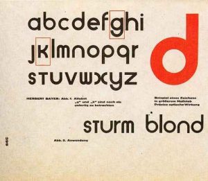
 - You Don’t Have to Abolish Capital Letters, But Sometimes It Helps. Like Kandinsky’s universal aesthetic, Herbert Bayer’s universal alphabet was designed to foster communication. At the time of its invention, almost all of Germany’s printed text was in Fraktur: a strange, antiquated, difficult-to-read typeface; a remnant of an age when monks and scholars published manuscripts for other monks and scholars. You’re probably familiar with Fraktur. It’s available in many modern font packages and in some versions of Microsoft Word. Mix dynamic and subtle movement together as yin means nothing without yang. Low load is the way to find stability in the high load.
The lesson: Make your design accessible. If you’re hoping to appeal to a wide audience, avoid over-stylizing. Reduce your design to its most essential elements. Always stay one chakra above your clients or pupils, use the KISS principle (keep it simple stupid), simple is best.
5. Share & Collaborate – The Bauhaus was founded on collaboration. Even though its founders and teachers were all giants in their fields, they also all served a greater purpose: design enlightenment. Not that there weren’t disagreements, but they managed to achieve an openness and collaborative style few groups of artists ever have. Their timelessness is a testament to that.
The lesson: Work with others, share ideas, and don’t live in fear of losing credit. Sometimes getting better and learning is more important. Mix with other practitioners both manual and movement, this will inspire, motivate and stimulate you.
6. Imitation is the Highest Form of Flattery: The Bauhaus is Everywhere.
Art is a continuum of great ideas. Many of the best ones have been done before, but you can always frame those ideas in new ways. Even if you didn’t know anything about the Bauhaus before reading this article, you probably recognize the look. It’s a cultural eye-worm and for good reason: it works.
The lesson: When you see a great graphic idea, be inspired. An original Bauhaus advertisement inspired this Obama poster.

So what ever type 0f movement practitioner you are be it Pilates, Yoga, GYROTONIC, Cross – fit etc etc – Mix it up and get creative. Remember everything came from somewhere. “An idea is nothing more nor less than a new combination of old elements”. James Webb Young
Bibliography
“How to get ideas” – Jack foster
Wilkepedia – Bauhaus
Bauhaus center – Tel Aviv